
Find out more about Anthology Illuminate
-
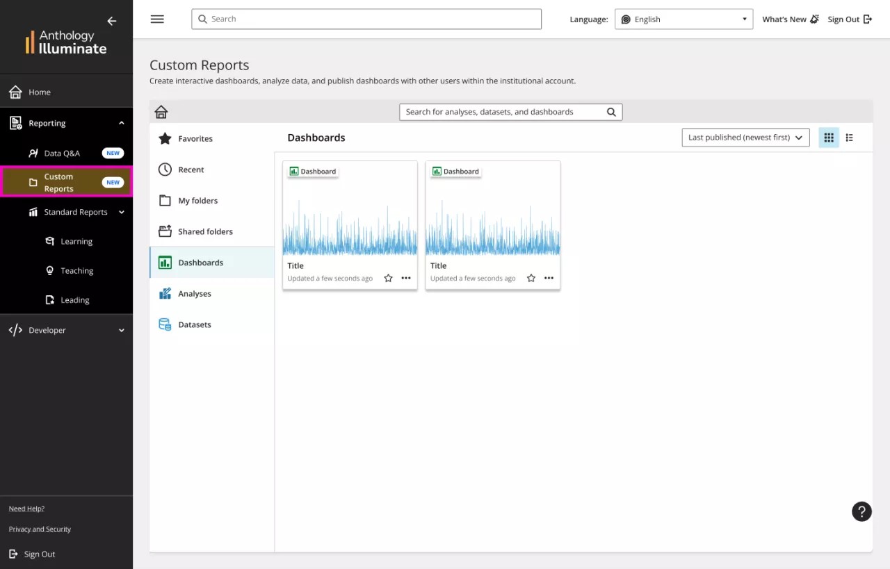
Custom Reports is one of our Anthology Illuminate Enhanced features.
Discover Custom Reports, a versatile feature that empowers you to craft personalized reports tailored to your unique needs. Our aim is to provide a centralized platform where you can efficiently manage your data: create it, analyze it, visualize it, and share it with key stakeholders to inform decision-making.
With Author you can:
- Connect with a wide set of preconfigured external data sources.
- Use pre-built data sets or create your own.
- Create reports and visuals using drag and drop tools and a wide set of visualization tools.
- Explore and visualize data depending on the user’s institutional hierarchy and role.
- Create dashboards and visualizations on the go in a no-code interface.
- Publish author reports and visualizations into a dashboard and share them with others.
- Drill down data using advanced visual filtering options.
- Set alerts and schedule reports to be shared automatically.
How to build a simple visual
There are a few steps you need to create a report:

To start, you need a data source, so you can:
- Create a new dataset from your own data source
- Use an existing data source: We already provided it for you! It is always filled with up-to-date institutional data (we provision data at least once a day) from Learn and many more sources.
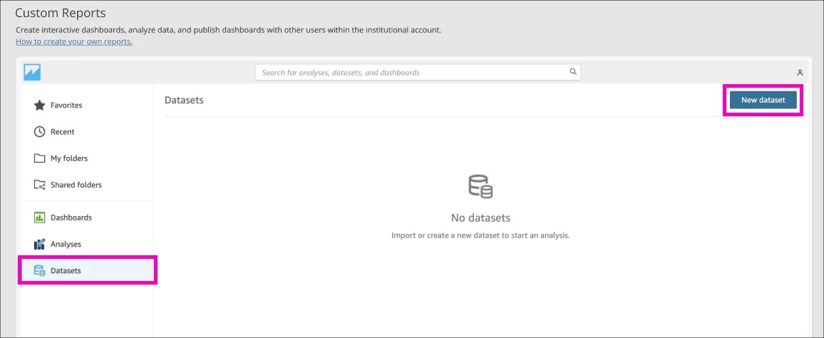
Create a new dataset
- Create a new dataset from your own data source
You can create a new one by selecting Datasets from the left panel of Custom reports, go to New dataset.
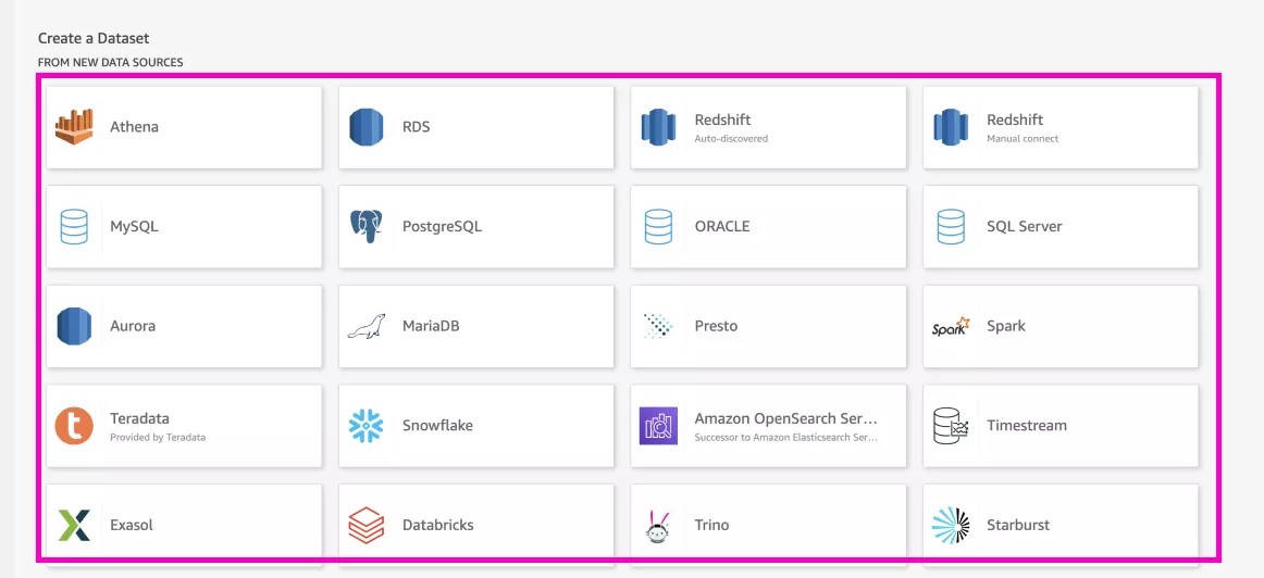
- Choose the data source
From the complete list, select the data source you want to use
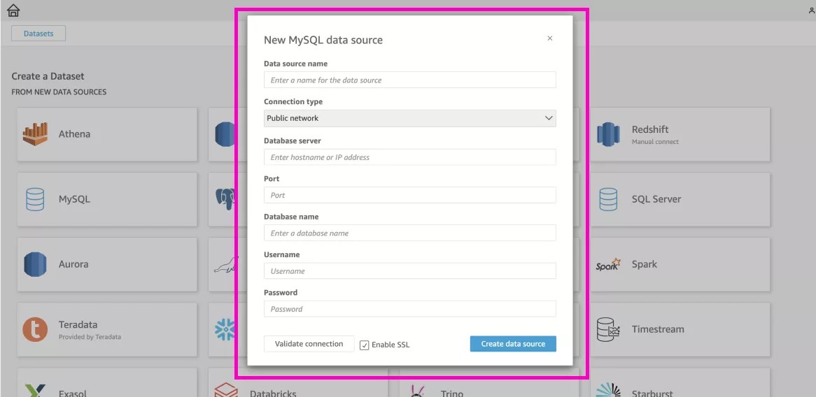
- Create the data source
Complete the information of your connection and select Create data source.
Create a data set from an existing data source
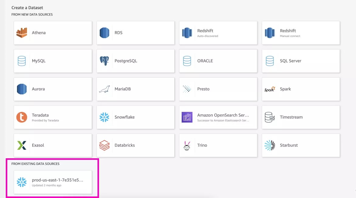
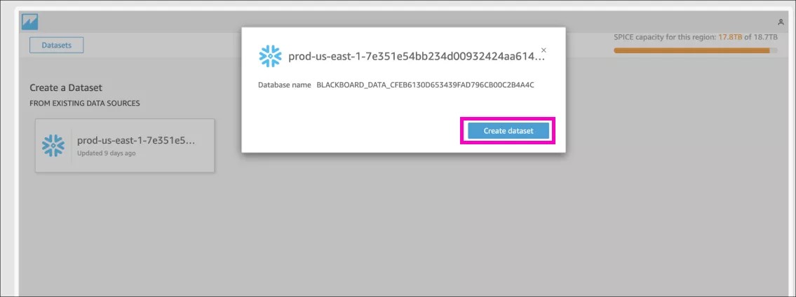
- Choose an existing data source
From the left panel of Custom reports, go to Datasets and then in the top right corner select New dataset.
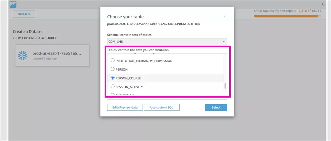
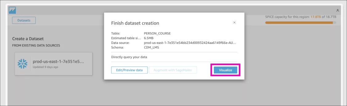
- Choose an specific table
You can choose an existing schema that already contains a set of tables, then, choose the specific table that you want to use. Finally select Visualize to finish the data set creation.
Explore all the data available
See the fields list directly in the Dataset section. You can see all the data that is available in the Data Dictionary or in Developer > Snowflake.
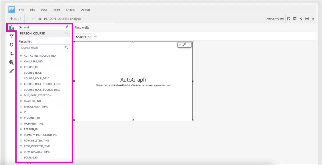
In this example, we chose the CDM_LMS.PERSON_COURSE table which contains the mapping between people and courses, user enrollment information, and role assignment in courses.
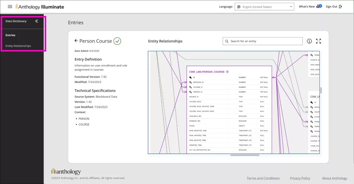
We recommend searching for data in the Data Dictionary Entity-Relationships diagram and checking the description.
Create a new Analysis and use the dataset you just created
Once you have a dataset, you can start creating your first analysis: an editable report. You can edit the visual as many times as you like until you find the most appropriate way to reveal key insights from your data.The difference between Analysis and Dashboard is that Analysis can be accessed and edited by Authors (only). The Dashboard contains the same information as its Analysis but in a read-only format.
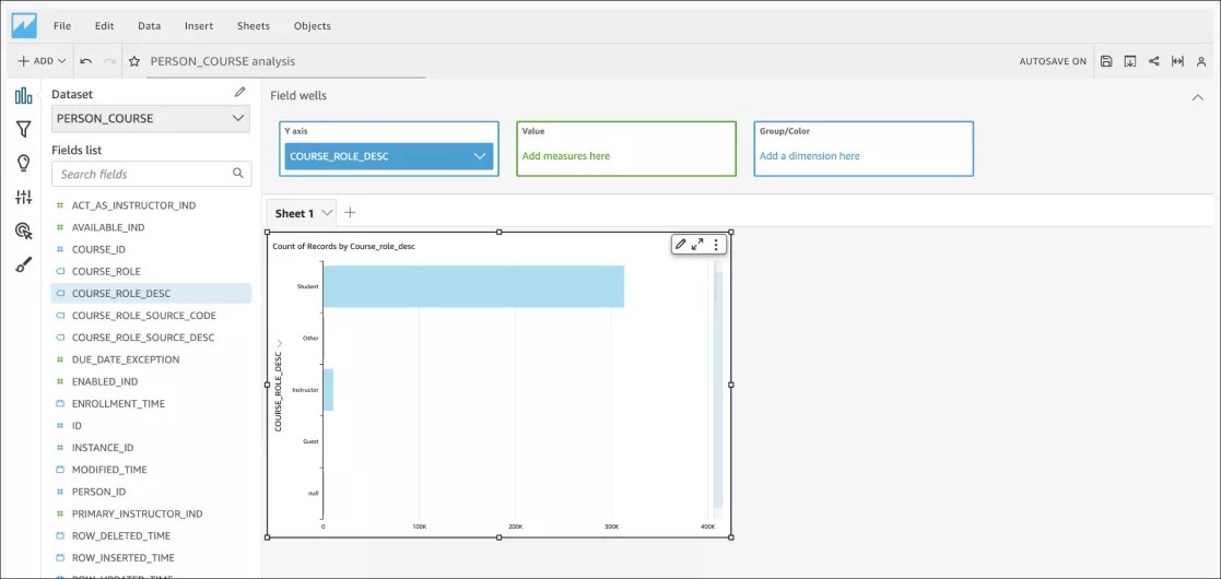
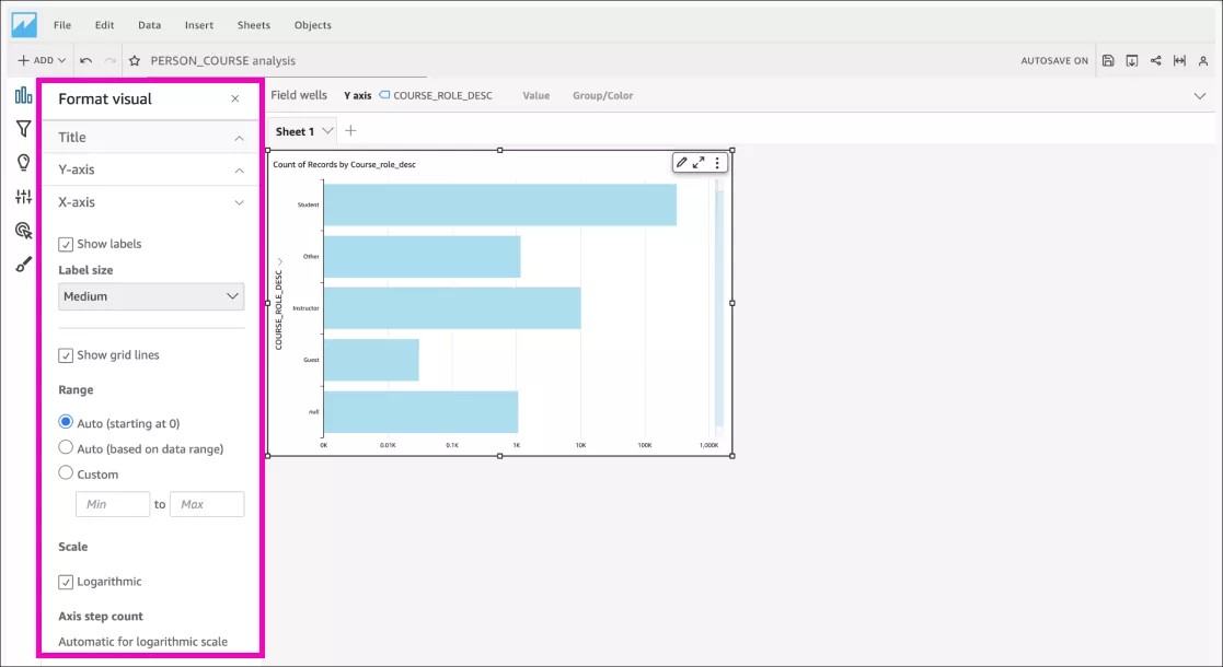
This simple visual counts individual roles within an institution. This institution has a lot of students compared to other roles, so it might be better to show the counts logarithmically.
Personalize the visual format
You can edit the title, legends, colors, labels, and more. Your first visual is ready!
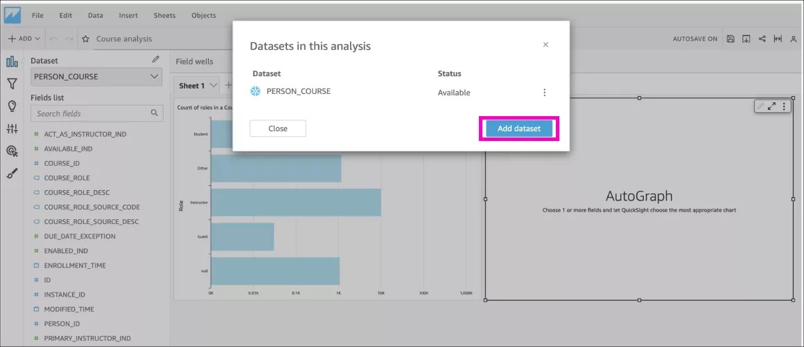
Pre-built tables are good for a start, but sometimes they are not enough for what you want to build. Custom Reports allows you to create your custom dataset, just follow the steps in the next section.
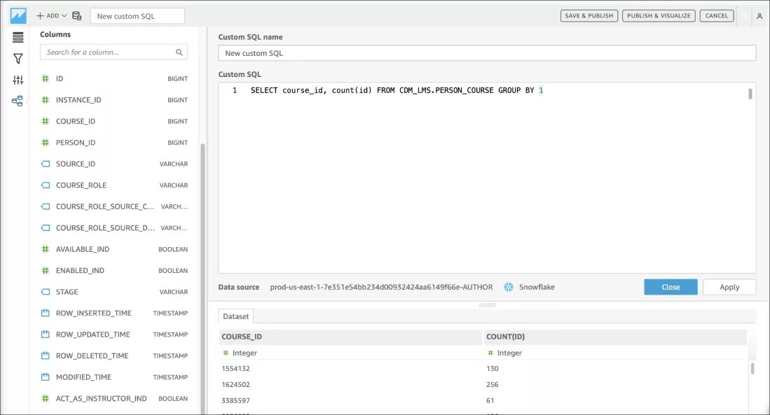
Add a bit of (spice) SQL
- Make your custom dataset powered by SQL query
When choosing a table, select Use custom SQL.
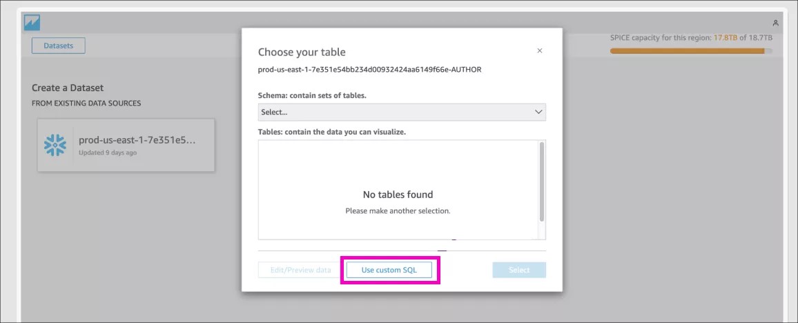
Beware that using difficult queries can time out. There is a limit of 2 minutes on query run for direct queries.
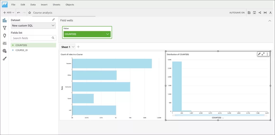
- Custom Reports helps with an initial AutoGraph
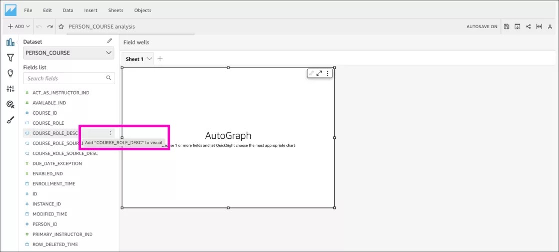
You can edit the dataset and choose 1 or more fields to let QuickSight create the most appropriate visual for your data.
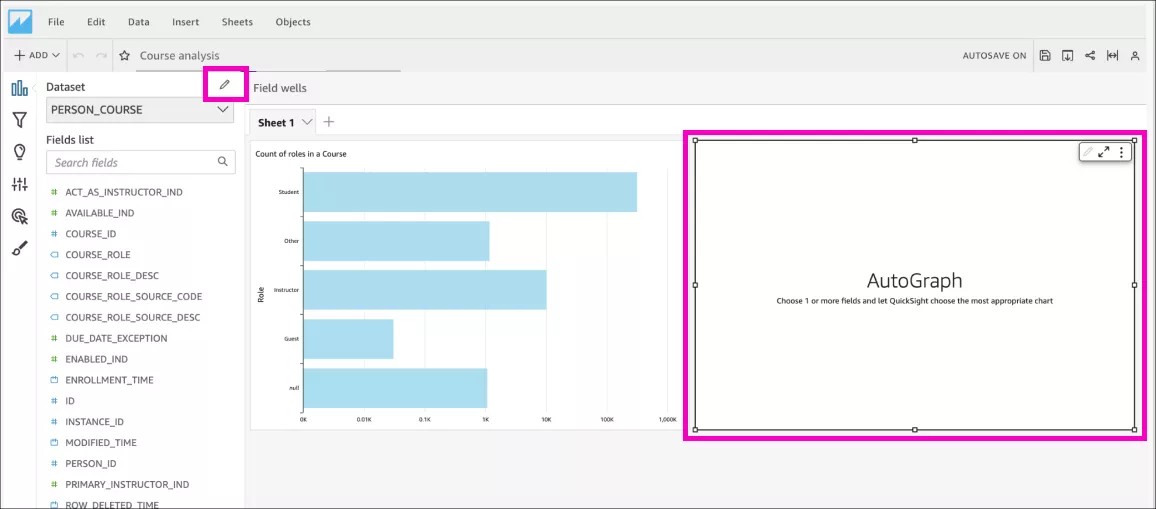
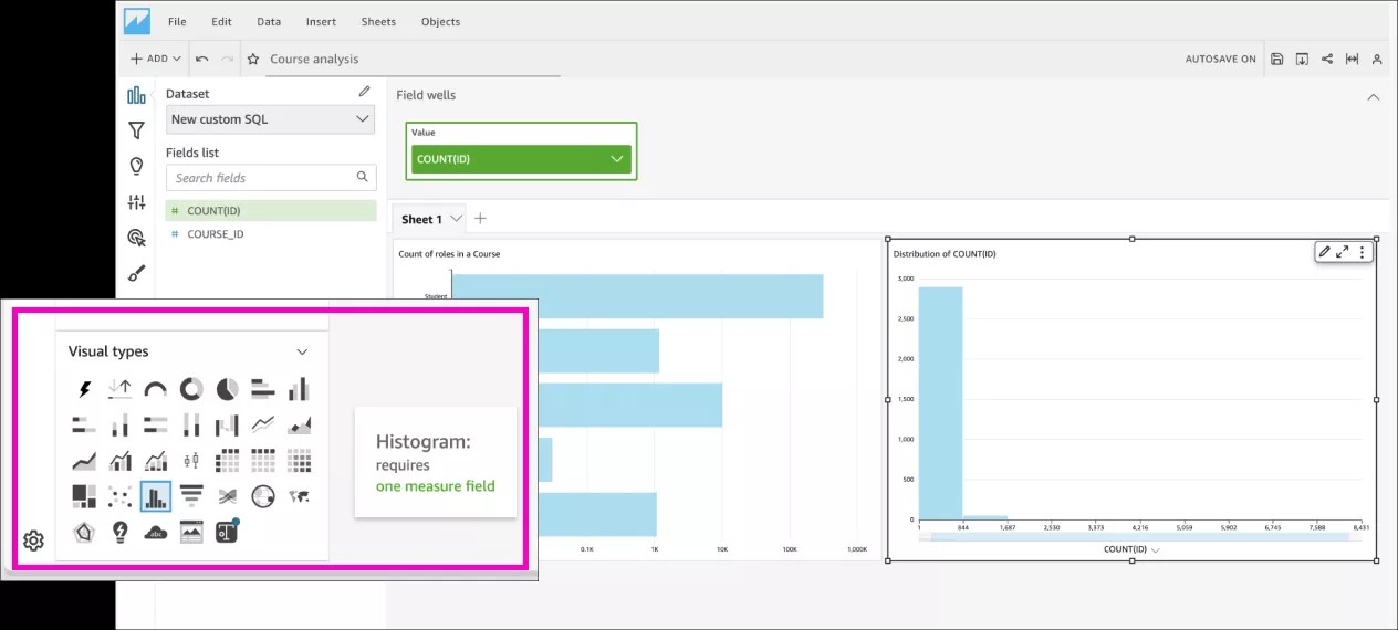
- Change the visual
You can select Correct metric in the AutoGraph and change the visual type.
In this example, with COUNT(ID), the visual was changed to histogram which is more suitable for such data.
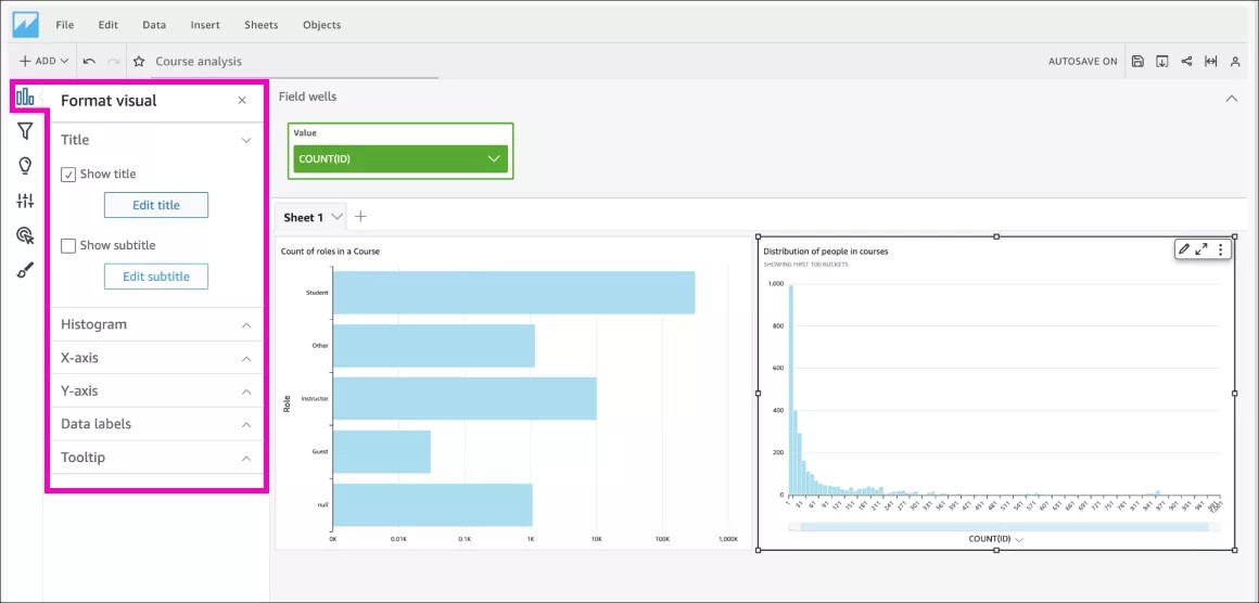
- Personalize the visual format
You can edit the title, legends, colors, labels, and more. Your new visual is ready, now share it with your peers!
Making a Dashboard out of an Analysis
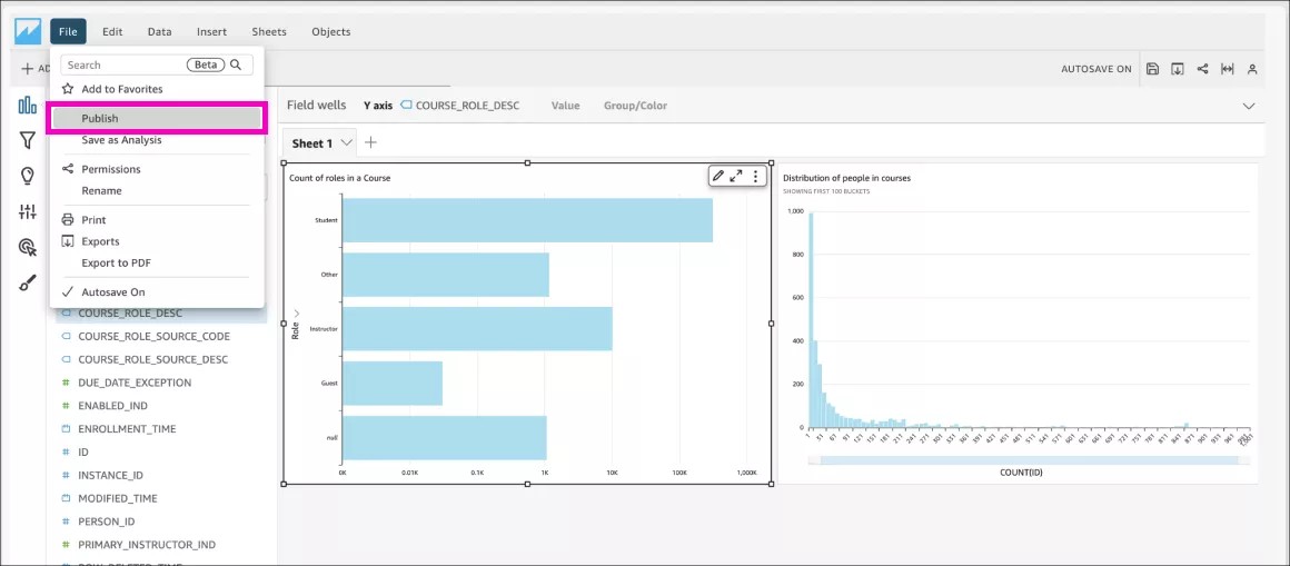
- Publish the Analysis
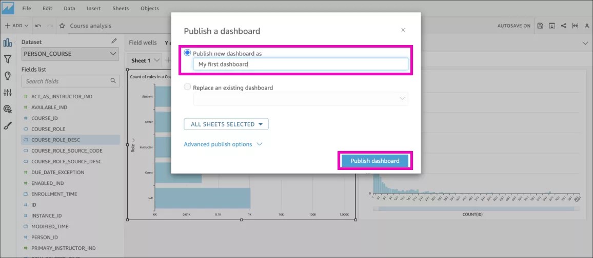
Go to the top menu, select File and then Publish. Give it some suitable name and then select Publish Dashboard.
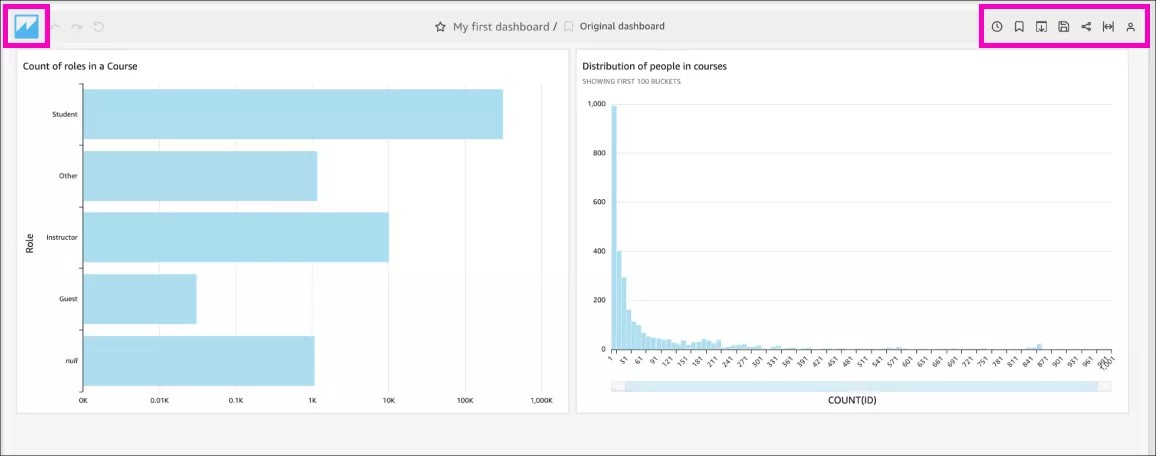
- Star it, share it, or export it
Go to the QuickSight home button to come back to the Author landing. From there, go to Dashboards in the left panel and see all your new dashboards.
- Share your dashboard with your Institution’s report Viewers
From the Dashboard section:- Select the three dots on the bottom right corner of the dashboard you want to share.
- Select Add to folder.
- Expand the Shared Folders list and select the Institutional Reports folder and select Add button.
- Finally, confirm the sharing action by selecting Add and share.
- Now, your dashboard is shared with all report Viewers. They only need to sign in Anthology Illuminate, go to Custom Reports and select the Shared folder section.
Navigating QuickSight
QuickSight is a tool with a steep learning curve, here some tips:
- Home button: Go to this button, anytime you want to come back to the landing page.
Save your work: Autosave is turned on by default, so every change you make in your dashboard is saved. If you want to just try things, you can turn the autosave off.
The autosave doesn’t properly work when more than one Author is autosaving their work on the same dashboard. We don’t recommend two Authors working on one dashboard at the same time.
- Save to PDF: Available through the Print option.
Folders: New analyses and dashboards are in the Recent section, and they are not part of any folder by default. If you want to have them organized in folders, Admins must create the appropriate folders to organize the new reports.
Readers aren’t able to create folders, only Admins.