Everyone should be able to read your text
It is important that the text can be seen and is legible. If you want your visitors to understand it, they need to be able to read it.
Good text contrast makes sure everyone can see the text against the background it sits on.
Not everyone sees color the same way. WCAG has defined specific contrast requirements in the WCAG 2.2 AA guidelines to make sure text is legible to everyone. Follow those requirements and our contrast best practices to fix or prevent contrast issues.
Ally follows the contrast requirements to verify there is enough contrast between text color and background color. Poor text contrast is a major issue. Major issues impact accessibility, and while not severe, require attention.
Use Ally to find text with poor contrast
Use Ally's accessibility report to discover and fix accessibility issues on your site. Use the link provided for the report and sign in. Open the report and look at the list of issues in the Accessibility Issues table.
The Accessibility Issues table is in both the Overview and Domain tabs. Start in the Domain tab to see issues specific to a domain.
It's a major issue to have text with poor contrast. Use the Major tab in the Accessibility Issues table to view the list to major issues. Select the issues with contrast issues.
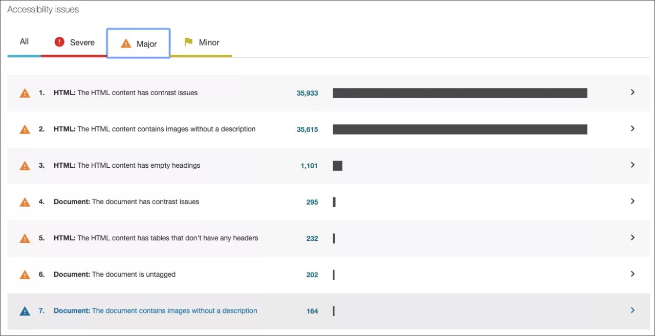
If you start in the Overview tab, select the issue and then the domain with the issue.
Contrast issues can start with Document or HTML in the list.
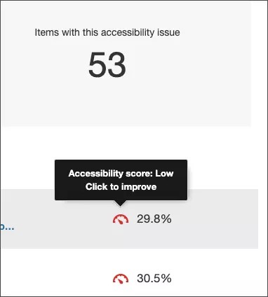
From the list of contrast issues in the domain, select the score indicator next to an item with the issue. The content editor feedback panel opens.
Preview the text with poor contrast
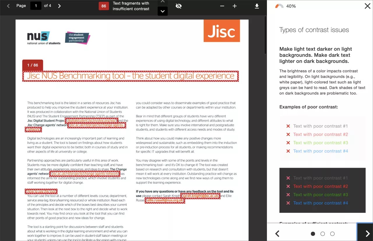
Ally’s feedback panel shows you a preview of the content as well as detailed feedback and support to help you fix your accessibility issues. Use the preview to see the text with poor contrast.
The preview highlights where specific accessibility issues can be found in the document. Highlights show every occurrence of one issue type at a time. For example, if your text has poor contrast, the highlights show you every place this specific issue occurs.
Preview tools
Use the preview tools to explore the issues in your document.

- Move through the preview page by page.
- See how many times a specific issue appears.
- Jump between the issue highlights.
- Hide or show the highlights.
- Zoom the preview content in or out.
- If the issue is in an attached document, download the original file.
Follow Ally's guided steps to fix poor contrast
Ally assumes you have basic knowledge of HTML and how to use your Content Management System (CMS). To follow the guided steps you need to know how to edit a web page in the HTML or source code in your CMS.
Ally also assumes you have permission to update color on your web site. Color is often defined in a site's style guide and can reflect branding. Before you make any changes, check your site style guide.
Along with the preview, Ally gives you step-by-step guidance on how to fix the issue. Ally organizes this feedback in a decision tree. All you need to do is read the directions and respond to the prompts. Learn what the issue is, why it matters, and how to correct it appropriately.
Select How to fix contrast to follow the guided steps.
Ways to fix contrast issues
When text has poor contrast it means that there isn't enough color contrast between the text and the background it sits on.
Ally's guided steps explain how to change the color of the text. You can also change the background color.
Before you make any changes, check your site style guide. Color is often related to branding and should be changed with caution.
Ally's guided steps also explain how to make the updates in the source HTML code of individual web pages. CMSs can vary. Some CMSs have a Rich Text Editor (RTE) that may provide user-friendly ways for you to style text. With RTEs you can pick the preset style for headings, colors, fonts, images and so on. However, not every CMS provides an RTE and requires edits in the source code with HTML. Sometimes both HTML and RTE are available as well.
For recurring contrast issues, you may want to update the template instead. Template updates need certain HTML and CSS knowledge and may depend on your site brand.
Visit w3schools to learn more about HTML and CSS
Color HEX or RGB
HEX and RGB are different ways color can be defined.
- RGB defines color by the amount of red (R), green (G), and blue (B) used. For example, a shade of red could be defined as RGB (253, 2, 2).
- HEX is a hexadecimal format that defines a color by the red, green, and blue values in a combination of six letters and numbers. Hexadecimals start with the number or hashtag (#) symbol. For example, the same shade of red would be defined as #fd0202.
Hexadecimal is the most common way to define colors on web pages.
Text contrast best practices
There are many low-effort adjustments you can make to improve text readability.
- Use fonts with wide character strokes.
- Use a font size of at least 12px. If using a font with thin character strokes, use at least 16px.
- Only use "thin" fonts on dark backgrounds.
- Use light text on dark backgrounds.
- Use dark text on light backgrounds.
- Avoid these color combinations:
- Green and red
- Green and brown
- Blue and purple
- Green and blue
- Light Green and ;yellow
- Blue and grey
- Green and grey
- Green and black
Not sure if your text has enough contrast? Use the Colour Contrast Analyser from The Paciello Group to check your content.
Why is text contrast important?
Low contrast text can be hard to read in many situations.
- When projected in class
- For students with color blindness
- On a mobile with a bright light or glare on the screen
- On low-quality monitors
Low contrast can cause eye strain, makes content hard to discover and scan, and causes frustration.
Good contrast means everyone can see the text clearly and enjoys a better overall experience reading your content.