We've compiled some best practices for creating digital content for your students. Use these suggestions and tips while creating and mapping out your classes.
Write for the web
Reading online is quite different from reading printed material. In preparing your site, you may find you have existing materials you want to use. To help maximize student learning, chances are you need to do some editing to get these ready for the web.
A 1997 survey conducted by Jakob Nielson shows that approximately 80% of test users simply scanned web pages. Only 16% read through the content word for word. Nielson's study also shows that most users read in an "F" formation: First, they sweet across the top part of the page. Next, they skip down several lines and carry out a second horizontal sweep, following this up with a vertical skimming of the left side of the page.
What does this mean for creating your site? Put the most important information in the first two paragraphs. If users don't read any further, at least they are exposed to the main concepts. Visitors with cognitive difficulties may quit reading part way through the page and will benefit if the information is structured in this way.
Consider using more of the following guidelines from Jakob Nielson's website:
- Present information in chunks.
- Use bulleted lists to further break up content.
- Put your most important content at the top of the screen or in the region of the browser window that loads first.
- Use short, concise sentences.
- Reduce word count. Recommended suggestion is to use 50% less words than you use in print.
- Highlight key words.
- Avoid using all caps. This is difficult to read and carries extra emphasis in a screen reader.
- Use a conversational tone.
- Avoid jargon and unnecessarily complex or technical language.
Write accessible content
Accesible writing makes your content easier for everyone to consume. Consider the following tips on how to write with accessibility in mind.
Write plainly
Documentation is only as good as what people can get out of it. If the writing is too complicated, they won't be able to use it. Plain language improves accessibility.
- Keep sentences short. They should be around 20-25 words at most.
- Use simple words. Use words, or combinations of word, with 1-2 syllables when possible. For example, use "to" instead of "in order to".
- Use contractions.
- Use tools like Hemingway Editor to measure the readability of your text. To meet WCAG standards, aim for a readability level of grade 8 and lower.
Heading structure
Headings are critical when creating accessible content. They provide screen reader users with the ability to jump directly to specific content, which can save them time.
Work with the system in which you are writing. All popular tools like Microsoft Word, PowerPoint, and Open office provide style and formatting options to help you build the proper structure into your documents. Use the styles and formatting options provided in your chose content editor tool.
Example: Heading 1 (<h1>)
The numbers in the heading style create structural context for the screen reader and help non-visual users understand the content.
Emphasize content
Screen readers do not identify font styles, including the following:
- Color
- Bold
- Italics
- Underline
- Strikethrough
Use these styles to provide visual breaks, do not use them as the only way to indicate importance or convey information.
Example: Red text looks like an alert. Screen readers will not announce the color of the text is red. As such, users miss the cue and don't know it's an alert
When you need to give a strong visual cue, make sure that you use an accessible alternative. Use an exclamation mark at the end of your sentence if it is important. Screen readers intonate exclamation and question marks. This means the tool will not read "question mark" but instead will lend a questioning tone as it reads a question aloud.
Alt text
Providing alternative descriptions for images and content allows screen readers to describe the image to non-visual users.
For decorative images, leave the alt text field blank. The screen reader will ignore the image in this case. An image is decorative when it doesn't add to the information on the page.
If you have an image that adds to the information on the page, you will want to add descriptive alt text for screen readers.
Example: If you have an image showing the tools available in a User Interface, don't just say "image of UI tools" in your alt text. Explain what the image is displaying. Be concise, clear, and descriptive. You do not need to say "Image of" as the assistive tools already know it's an image.
Infographics
An infographic is a narrative that tells the same story the users get from the visual.
Infographics require a text alternative. The text alternative should be on the page immediately following the infographic. Include an anchor link at the top of the page to view the text alternative.
See an example of an infographic with a text alternative
Links
It is critical to make your links descriptive. Every link should describe what the user can expect to find when they click on it.
This is key for the Links List tool that screen readers provide. This tool only lists the links on the page, nothing else. There is no additional context for the lnik.
Consider these tips as you create your links:
- Avoid using generic phrases. Phrases such as "click here" or "see more" are not descriptive on what a user will see or where a user goes when clicking on the link. The Links List tool will read the text of the link exactly as entered. Use descriptive text for your links so users know what clicking on the link will do or where it will take them.
- Avoid web addresses or URLs. Web addresses and URLs are not considered informative and shouldn't be used. The screen reader reads each letter individually. Instead, make the text descriptive.
- Avoid opening in a new window. Opening links to a new window can be disorienting. Keep them to a minimum and be sure to tell your users when you are using a new window.
Lists and tables
Let the tools in which you are creating content do the work.
Use the bullet, numbered list, and table tools in the content editor, or view the source and use the correct HTML tags.
Lists
Bulleted list HTML: <ul>
Numbered list HTML: <ol>
Properly created lists inform the screen reader how many items are in the list, and will read the number for each item in a numbered list.
Tables
Use lists over tables when you can! Tables can be made accessible, but screen reader users need to know advanced keystroke commands to navigate and understand tables.
Use column headers (<th>) which causes the screen reader to re-announce the column heading for each cell as the user navigates through. This gives the user context for each cell content.
Editor tools
Here are the tools available in the TinyMCE Editor. Use these icons to format and align your text, view and edit source code, add links and photos, add links to files, add a horizontal rule, add special characters, check spelling, insert toolbox items and insert bulleted and numbered lists.

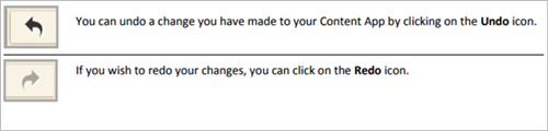
Undo and redo
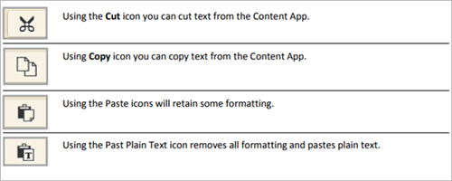
Cut, copy and paste text
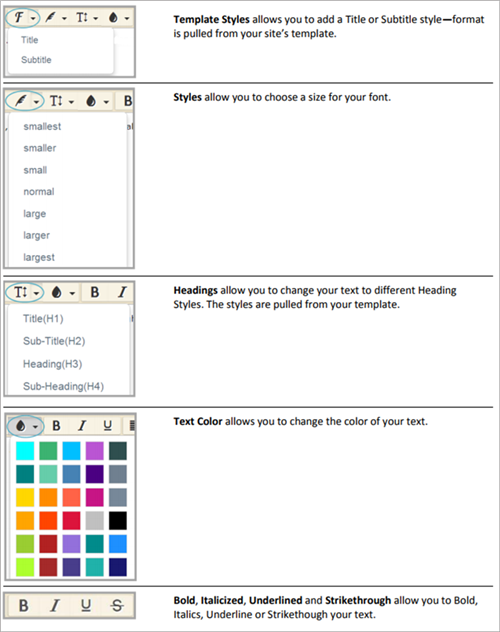
Format text
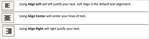
Align text
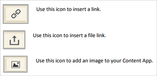
Insert links and images
Tips for using graphics
Use graphics purposefully and not just because they look good. You can use graphics to enhance other content or serve as standalone instructional elements. They can provide valuable information and assist in navigation of your course.
Consider the following suggestions when adding graphics to your course:
- Use simple graphics. Clean and simple is often the most effective. You don't want design overtaking content, nor do you want to increase download times unnecessarily. Avoid lengthy text and lots of numbers within the graphic.
- Avoid background images. Use a white or pale solid background with dark text instead of adding background images. High contrast between text and background is easier to read.
- Watch the file size. Large and numerous images may look great on your page, but they will frustrate users who must wait for images to load.
- Use the right format. It's important to save your pictures in a web-ready format. In general, use the PNG format for simple graphics such as logos, charts, and drawings. The JPG format is usually better for photos and images with subtle shadings or gradients. The JPG format also allows for better compression of a file. Select the best format for better image quality and smaller file size.
- Crop photos. Cut out nonessential areas of an image to maximize impact and decrease download time.
- Use animated images sparingly. They can cause the screen, or parts of it, to flicker and change rapidly. Animations can detract from the accessibility and usability of a page. Moving images also cause problems for students with cognitive impairments and may be hard to interpret by students who have low vision.
- Provide alternative text using the ALT attribute. Screen readers and other text-to-speech software read the image's alternative text aloud to the user.