Increase engagement with good design
Do you know all the components that go into creating a great website design? The look and feel of a website impacts communication and community engagement at your school. Colors, text, functionality, and interactivity are some of the core principles you need to know to create an engaging website.
These tips were presented by the Blackboard Creative Services Design Team in the "Why Design Matters: How a Well-Designed Website Can Increase Engagement." To view the full set of design tips, watch the video recording.
Check your text color contrast
Text color contrast refers to how well text stands out against a background. The WCAG 2.1 AA standards note that you must use a contrast ratio of 4:5:1 except for large, incidental, or logotype text. A safe way to make sure you’re meeting requirements is to use the free WebAim Color Contrast Checker or the Colour Contrast Analyser from the Paciello Group.
Choose fonts and sizes that are readable
You put text on your website so people can read what you have to say. Make sure your fonts aren't too small or hard to read. Avoid blinking or moving text. Keep your site clean and professional by choosing two typefaces for your website. Use one for body and text and one for headings. Font Pair is a great resource to help you choose complimentary fonts.
Know the difference between user experience and user interface
User experience is how your website makes someone feel. Think about who's using your site, how and why they're using your site, and what information they want to see. Knowing your audience helps determine where they expect to see certain visual elements. Meeting these expectations creates a great user experience.
User interface is how your website looks. Your user interface includes navigation, buttons, images, colors, and content. Your user interface plays a large part in the user experience for your site.
Use placement and key website elements
When you walk into a school, you expect to see an office near the main entrance, classrooms in hallways, and a cafeteria on site. Website visitors also expect to see certain visual elements throughout your site. Including these expected visual elements helps create a more user-friendly and visually-pleasing website.
- 98% of visitors expect a logo on the top left of a website page which links to the homepage.
- 88% of visitors expect main navigation across the top.
- 78% of visitors expect a search bar on the top right.
- 72% of visitors expect contact information in the footer.
Create visual hierarchies
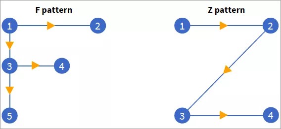
Our brains follow certain patterns and habits when consuming content. When reading a book in English, for example, our eyes automatically read from top-to-bottom and left-to-right. The same thing happens with websites. Visitors typically scan a website instead of reading every word. To accommodate that flow, it's important to build a visual hierarchy. The two most popular ways to create a hierarchy are the F Pattern and the Z Pattern.
The F pattern works best for information-heavy websites. The design flows from left-to-right, top-to-bottom, and is very conventional.
The Z pattern works best for websites that don't have a lot of information. It allows users to skim from your logo at the top left, through your navigation, down to your first important piece of information, and then across the page.
When choosing your hierarchy and pattern, remember the main goal is to guide visitors to the important areas of your website. Use color, spacing, and sizing to help break up your information and highlight areas of interest.

