Outstanding online courses begin with outstanding content presented in a way that minimizes barriers to understanding.
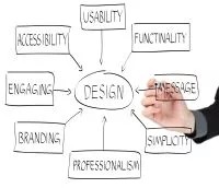
Effective content design can create a more compelling and engaging showcase for your course material. Well-designed content can help your content meet these needs:
- Ease of learning: How quickly can a new student navigate through your course while learning the material?
- Efficiency of use: After students are familiar with your course setup, how quickly can they accomplish tasks?
- Subjective satisfaction: How much do students enjoy working through your course material?
- Usability: Can users with different levels of ability, experience, knowledge, language skills, hardware, or concentration level use your course easily?
- Accessibility: You want people with disabilities to receive the same level of information, services, and use that people without disabilities receive. Is your course a level playing field?
Effective design can also be a simple and straightforward design. Clean and simple can be aesthetically pleasing and still have impact.
A well-designed course requires planning. You must consider not only visual design, but also writing style, tone, the arrangement of information, and accessibility.
Focus on accessibility
As you prepare your content for an online course, keep in mind that students have diverse needs. The majority of your class may not have any form of physical disability. But, one of your students may be blind, deaf, or have difficulties concentrating.
Tim Berners-Lee, inventor of the World Wide Web said, "The power of the web is in its universality. Access by everyone regardless of disability is an essential aspect." Your online course should be no different.
Blackboard is committed to accessible applications, ensuring the environment itself is as accessible as possible to all users.
You can follow a few simple guidelines and provide the same level of instruction to everyone.
- Make sure your information design is solid and logical.
- Keep the layout clean and simple. Use the same layout for as many pages as possible to help build predictability.
- Use cascading style sheet (CSS) technology. Style sheets separate content from the structure of a page, making web pages more accessible to those who use screen readers or specialized browser software. Style sheets help control the look of the page.
- Choose high contrast color combinations for text, backgrounds, and graphics. Keep backgrounds simple. White works best with a dark color for textual content.
- Add alternative text that describes images for people who use screen readers or visit web pages with images turned off. Add alternative text for all images, with two exceptions:
- The text surrounding the image conveys the meaning of the image
- The image isn't needed for understanding, such as a bullet
- Create links that are significant without their surrounding content. Avoid links with vague text, such as "click here."
- Use HTML written to W3C specifications. Check your pages against W3C standards. Ideally, enlist people with disabilities to test your course and provide feedback. You can use these online accessibility tools:
- From the creators of the A-Checker accessibility checker, the UI Options tool provides a way to enhance or improve website usability, flexibility, and accessibility by providing a way to customize and control aspects of a website without the need for additional software or tools.
- The WAVE Accessibility Tool is a free, web-based tool that allows you to quickly and effectively evaluate the accessibility of your web content.
Writing for the web
When you prepare your content for your online course, you may find you have existing materials you want to incorporate into Blackboard Learn. To help maximize student learning, chances are you need to do some editing to get these ready for the web.
Reading online is quite different from reading printed material. In a 1997 survey conducted by Jakob Nielson, researchers found approximately 80% of their test users scanned web pages. A mere 16% read through the content word for word.
The study also showed most users read in a roughly "F" formation. First, they read across the top part of the page. Next, they skip down several lines and carry out a second horizontal sweep, following this up with a vertical skimming of the left side of the page.
What can you learn from the online reading habits of the test users? First, put the most important information in the first two paragraphs. If students don't read any further, at least they're exposed to the main concepts you want to get across. Students who have cognitive difficulties may quit reading part way through the page and will benefit if the information is structured in this way.
This table lists more guidelines from Jakob Nielson's website.
| Guideline | Description |
|---|---|
| Assist page scanning |
|
| Create well-structured paragraphs |
|
| Reduce word count |
|
| Highlight keywords |
|
| Use a conversational tone |
|
Effective layouts
While the format of text alone is important for readability, page design and layout also impact the effectiveness of your content.
As you design your pages, use these principles:
- Use clean and simple pages. Use plenty of white space to separate paragraphs, images, and other page elements to avoid overwhelming readers.
- Use block-style paragraphs. Leave a space between each paragraph and don't indent the first line.
- Be consistent. Create predictability with layouts that repeat design elements from page to page. Use the same fonts, colors, and heading styles on each page to help students feel comfortable and find information faster.
- Use headings. Chunk information and make your pages easier to scan.
- Use a consistent color scheme. Use no more than five colors. Different shades of the same hue, with one or two accent colors, is an effective scheme. Choose colors that maximize readability. When in doubt, use black on white.
Enhance with graphics
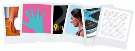
You can use graphics to enhance other content or serve as standalone instructional elements. Graphics can provide valuable information displayed in charts, photos, diagrams, examples. Images can assist in navigation with the use of banners or provide visual cues to help orient the student to the course with the use of icons.
Well-designed graphics can help students in these ways:
- Navigate and locate different types of information through visual clues.
- Interpret difficult to understand information.
- Form visual mental models of the materials explained in the text.
- Better understand the relationship between ideas or concepts.
- Use graphics purposefully and not just because they look good. You don't want design overtaking content, nor do you want to increase download time unnecessarily.
This list includes some basic rules for image use:
- Use the right format. You must save your pictures in a web-ready format. In general, use the PNG format for simple graphics, such as logos, charts, and drawings. The JPG format is usually better for photos and images with subtle shadings or gradients. The JPG format also allows for better compression of a file—a 1500 kb file can reduce to 150 kb—but this may reduce some image quality. Select the best format for better image quality and smaller file size.
- Be careful with animations. Animations can be extremely effective when you want to demonstrate concepts and principles but are often overused. Be sure the animations don't distract from the material, and you use them with permission.
- Avoid background images. Use a white or pale solid background with dark text instead of background images. High contrast between text and background is easier to read.
- Watch the file size. Large and numerous images may look great on your page, but they'll frustrate users who must wait for images to load.
- Crop your images. Smaller image sizes maximize impact and decrease download time.
Reduce your course size
Be mindful of the sizes of the courses you create—your Blackboard administrator will appreciate it! Your institution might have course size limits. You can minimize the uploaded file sizes as you create content to stay within the limit for the entire term. These recommendations can help you conserve disk space on your institution's server. Your institution might have additional policies that you need to follow.
Video: You can link to videos rather than upload your video files to your course. Instead, upload your videos to YouTube™, Vimeo, or a separate media server on campus and then link to them within your course. Be mindful of intellectual property rules. For example, it might not be legal to host a video from National Geographic on Vimeo, even if you licensed it to use in a course.
Use mashups: Upload slide presentations to SlideShare, video to YouTube, or images to Flickr©. You can embed these elements in your Original course with the Blackboard Learn mashups tool.
Course Files or Content Collection: Look for large file sizes and unused files and folders that you can delete.
Reduce file sizes: Before you upload files, try to reduce the size of these:
- Microsoft Office files: Use the tools available in Microsoft Office to reduce file size for slide presentations and Word files. The Reduce File Size option is located in the File menu. You can also save files as PDFs before you upload them, which often makes smaller, read-only versions of the files.
- Images: Use a graphics program to resize images for screen viewing before you upload them. You can also use an online service such as Shrink Pictures or picresize®.
- Audio: Use software to resample or trim audio files to reduce their size.