This information applies only to the Original Course View. Your institution controls which tools are available.
Style options control the appearance, theme, course menu style and layout, content appearance, course entry point, and the banner image for a course.
On the Control Panel, expand the Customization section and select Teaching Style to access course style options.
Select a course structure
Course structures contain course areas, optional content examples, and instructions to help you design your course. Select a structure to view its description and preview of what its menu looks like when added to a course. You can opt to include content examples when you add a course structure to your course.
A selected course structure's content is added to your course and doesn't replace existing course menu items and content. You can edit and delete course structure content in the same way as other created or imported content. Before you begin, export or archive your course so that you have an original version before you add a course structure. Or, request an empty course for experimentation with course structures.
If the Select Course Structure section isn't visible, your institution has disabled it.
Use these steps to select a course structure:
- On the Control Panel, expand the Customization section and select Teaching Style.
- On the Teaching Style page, in the Select Course Structure section, the left column displays all course structures in a list. Select a course structure to browse its description and preview its course menu. In the preview, you can select a course menu link to learn the purpose of that item in the course structure. You can also select the link to learn more about course structures.
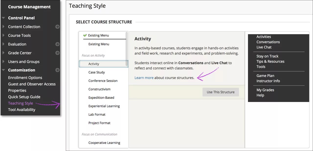
Choose a course structure and select Use This Structure. Your chosen course structure is indicated by a green check mark at the top of the course structure selection tool.
To revert, select Existing Menu in the course structures' list and select Use This Structure. No changes are made to your course.
- After you select a course structure, the Include content examples check box is revealed. Select the check mark to add content items and instructions as well as the course structure's menu links. If you don't include content examples, only menu links are added to your course.
- Select Submit to add the course structure content to your course. Select Cancel to exit without adding a course structure.
Including content examples populate the course structure with content items appropriate for the course structure type. The content examples are intended to be guidelines for the creation of your own content. The sample content is unavailable so that students can't view it. If you decide to use the content examples, edit them to fit your course and make the items available to users.
Select the course entry point
The course entry point is the first area users see when they enter your course. The default course entry point is the Home Page and contains modules that alert students to activity in your course.
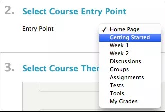
You can change the entry point. Choose an available area from menu. Available entry points are all the areas that appear on the course menu.
The new entry point takes effect immediately for users who log in to the system after the change. Users who are in the system when the change takes place will see the new entry point the next time they log in.
Watch a video on how to design your course entry point
The following narrated video provides a visual and auditory representation of some of the information included on this page. For a detailed description of what is portrayed in the video, open the video on YouTube, navigate to More actions, and select Open transcript.
Video: How to Design Your Course Entry Point explains how to set your course entry point page and add a banner image to it.
Apply themes
If your institution uses the Bb Learn 2012 system theme, you can choose a course theme from this page. Course themes add a background image to the course display and change the color of the menu, buttons, and controls. Use the list to choose the appropriate course theme from the thumbnail sample images. You can change the theme at any time. Themes don't affect course content or a chosen course structure.
If your institution has made themes unavailable, the course themes icon doesn't appear.
You can also change course themes from anywhere in your course with the Change Course Theme function. Point to the themes icon to view all the available course themes and select one. Scroll through the theme preview box and select a theme.
The course theme changes immediately to the new choice. To change the theme, select another.
Select the menu style
You determine whether the course menu appears as plain text with a colored background or as graphical buttons with text on them. When you choose menu colors, select colors for the background and text that display a high level of contrast to ensure readability and accessibility.
As you make choices in the Select Menu Style section, the Preview sample menu shows what the settings will look like once submitted.
Select Text and choose the background color and text color by accessing the contextual menu to access the color swatches. A large palette of preset colors is available. You can also provide a hexadecimal color value. Select a color, and then select Apply.
Select Buttons and expand the Button Library to choose from these options:
- Button Type: From the menu, select Pattern, Solid, or Striped.
- Button Shape: From the menu, select Rounded Corners, Rectangular, or Rounded Ends.
- Button Color: Optionally, to narrow the available choices, type a color or button name and select Search.
As you select each option, the buttons in the Button Library change to reflect the current choices. Select a button in the library.
Set the default content view
The Default Content View setting determines how content items appear in folders when users access the course for the first time.
- Icon Only displays content items as titled icons with no descriptions.
- Text Only displays content items as titles with short text descriptions only.
- Icon and Text, the default option, displays titled icons with descriptions.
Changing the default content view affects only new content areas. To change all existing pages as well, select the check box to Apply this view to all existing content.
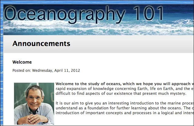
Select a banner
You can add a banner image to appear at the top of the course entry point. The banner image is automatically centered.
Use Browse My Computer to locate an image file on your computer. You can't use images stored in the Content Collection or Course Files. However, a copy is stored there with each new upload. If you delete the image from the course entry page, the image file remains in the course's file repository in the main folder.
A recommended size for banners is approximately 480 by 80 pixels. When you choose a banner image, keep in mind that users can resize their browser windows, expand and collapse the course menu, and use monitors of varying sizes and screen resolutions. After you upload a banner, view it under those conditions to be sure that it appears as intended.
 Servei d'assistència per tuit @BlackboardHelp