Learn 2016 Theme for improved mobile experience
Blackboard Learn SaaS Continuous Delivery v3000.4.0 | Release to Production 24 June 2016
This release includes a new theme for the Original experience that provides a more modern look and feel. Most importantly, the Learn 2016 theme significantly increases the responsiveness of the interface for small devices.
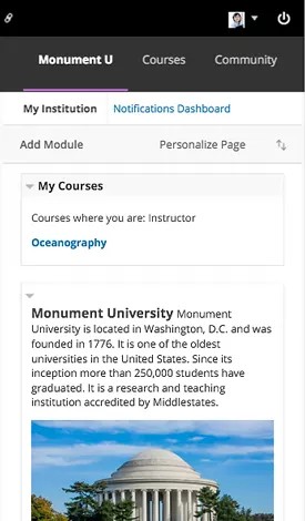
The theme also incorporates elements from the new Blackboard design language including color, fonts, and spacing, for greater consistency between Blackboard Learn, Collaborate Ultra, and the Bb Student app. Finally, the theme improves the responsiveness of Original courses in the Ultra experience.
The Learn 2016 theme replaces the Learn 2015 theme in the theme manager. We do not recommend using the 2015 theme with the Original experience, regardless of deployment type. The new Learn 2016 theme is intended for use with the Original experience.
Important notes:
- Institutions retain the option to customize the login page in the Original experience.
- The course menu navigation collapses automatically on small devices (less than 768 pixels wide). Users open the navigation menu to make a new selection; then the menu collapses again, in order to maximize screen space for content and tools.
- Modules on tabs or a course module page will shrink to size on larger devices; on smaller devices, columns will collapse to a single column and the modules will stack.
- Instructors cannot use course themes with the Learn 2016 theme, because they are not responsive.
- The theme cannot present content responsively if the content itself isn't responsive. Content authored with the Content Editor must be authored responsively in order for it to conform to a mobile device. For example:
- Images should be added and displayed at 100%, rather than as fixed pixel sizes.
- Tables used to organize or present content should be avoided, since they typically have specified cell and table sizes that won't work with mobile devices.