Everyone should be able to read your text
Sharing presentations, documents, and course content with students can provide them with useful review and study materials. It's important that the text can be seen and is legible. If you want your students to study it, they need to be able to read it.
Ally's contrast checks verify if there is enough contrast between the text color and its background color. Text with poor contrast can be difficult to read for everyone, but especially for students with visual impairments such as color blindness.
Ally uses the contrast requirements specified as part of the WCAG 2.2 AA guidelines.
Fix the contrast in your file
If your text has poor contrast, you need to fix it in your presentation or document software. Upload the new file to Ally when you’re ready. Select How to add descriptions for step-by-step guidance on how to do this.
- Select How to add descriptions and follow the instructions.
Open the file on your computer.
If you don't have a copy of the file on your computer, leave the instructor feedback panel and download the file from the course.
- Change the contrast of the text.
- Microsoft® Office: Select the text. Open the Font Color menu and choose a new color with more contrast.
- LibreOffice: Select the text. Select the arrow next to Font Color and choose a new color with more contrast.
- Use a tool like the Colour Contrast Analyser from The Paciello Group to check the contrast of the text.
- Save the file.
- Upload the updated file to your course.
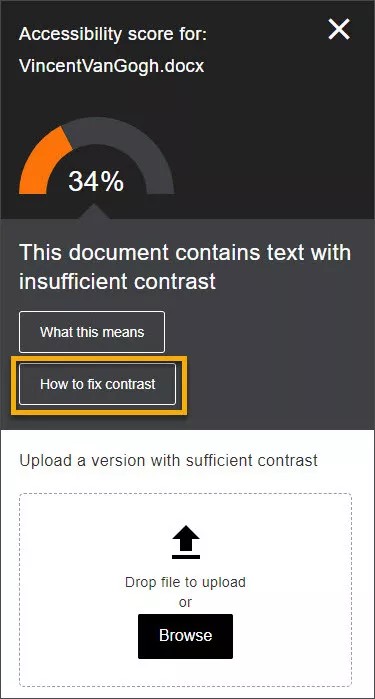
If you still have the instructions open in the instructor feedback panel, select Next and Browse to upload your file. If you don't have the instructor feedback panel open, select the Accessibility score indicator next to the file in your course and select Browse to upload your file.
Fix the contrast in your WYSIWYG content
Create or edit content in your course WYSIWYG editor. As you type or make changes, the Ally score updates immediately. Scores range from Low to Perfect. The higher the score the fewer the issues.
Learn more on how to fix text contrast issues in your course WYSIWYG editor
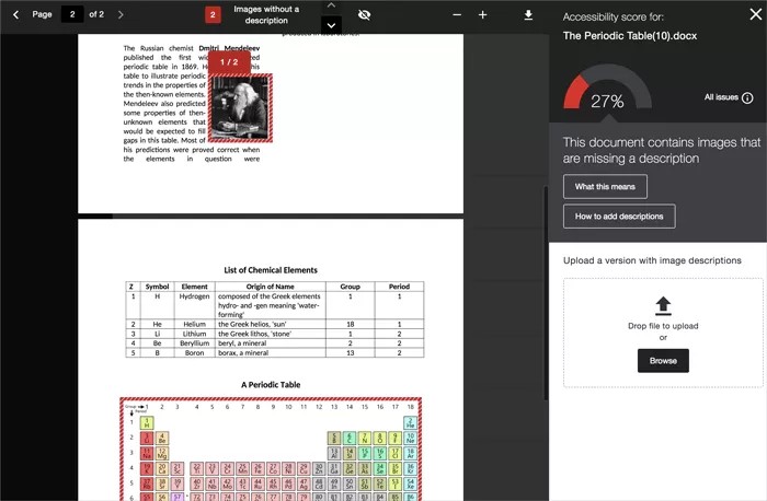
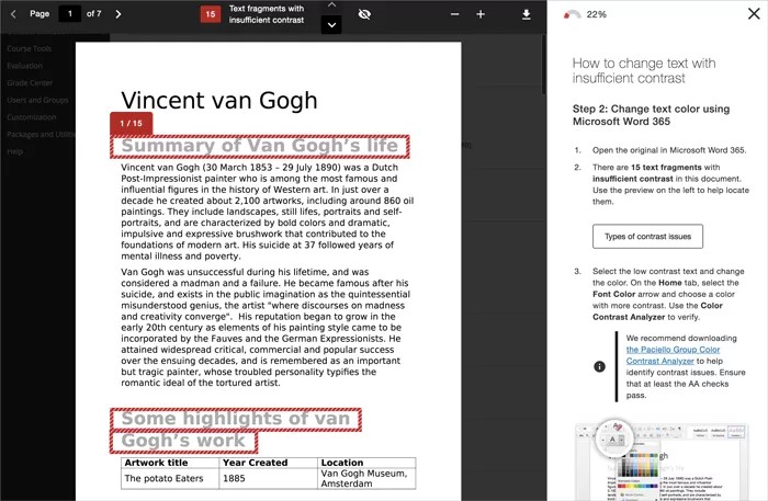
Preview Where the Accessibility Issue Is
See where this issue is
The preview highlights where specific accessibility issues can be found in the document. Highlights show every occurrence of one issue type at a time. For example, if your images are missing alternative descriptions, the highlights show you every place this specific issue occurs. If your document also has poor text contrast, select that issue in the feedback panel to see the occurrences of that issue highlighted.
Highlights are provided for these issues:
- Images without an appropriate alternative description
- Text fragments with insufficient contrast
- Tables without table headers
All other accessibility issues are not highlighted in the preview.
Missing text description
Text contrast
Scanned PDF
Preview tools

Use the tools above the preview to explore the issues in your document.
- Move through the document preview page by page.
- See how many times a specific issue appears in the document.
- Jump between the issue highlights.
- Hide or show the highlights.
- Zoom the preview content in or out.
- Download the original file.
Text contrast best practices
There are many low-effort adjustments you can make to improve text readability.
- Use fonts with wide character strokes.
- Use a font size of at least 12px. If using a font with thin character strokes, use at least 16px.
- Only use "thin" fonts on dark backgrounds.
- Use light text on dark backgrounds.
- Use dark text on light backgrounds.
- Avoid these color combinations:
- Green and red
- Green and brown
- Blue and purple
- Green and blue
- Light Green and yellow
- Blue and grey
- Green and grey
- Green and black
Not sure if your text has enough contrast? Use the Colour Contrast Analyser from The Paciello Group to check your content.
Why is text contrast important?
Low contrast text can be hard to read in many situations.
- When projected in class
- For students with color blindness
- On a mobile with a bright light or glare on the screen
- On low-quality monitors
Low contrast can cause eye strain, makes content hard to discover and scan, and causes frustration.
Good contrast means everyone can see the text clearly and enjoys a better overall experience reading your content.